Статьи по программированию под движком Gold Source и работе с SDK игры Half-Life Articles on programming under the Gold Source engine and work with the SDK Game Half-Life
VGUI - interface concept and the structure of its components
Table of Contents:
Usually
people who are not very familiar with VGUI (Versatile graphic user
interface - to change the graphical user interface) when trying to
design something in it or just try to understand how the machine of
working experience to say the least not weak sense of loss. Still,
after all is just to get into this mess, who does the code any more or
less decent menus, so there and then get lost in all these toolbars,
alerts, Handler, and God knows what. And despite the fact that from Valvo general there is no documentation on VGUI. Of
course, you can always go for HLprogramming, or anywhere else, and
there are several guides to download pages at five, and something to try
to squeeze out of them. But the leadership, starting with
the words "Open TeamFortressViewport.h, and on the 32nd line, add this
and that," though will show you how to copy and rename it TeamMenu in
MyFirstVguiMenu, but did not give any knowledge of how it all works. So at first I better try to outline a complete picture of the principles of VGUI, and then we move on to drawing their sockets. So, what can be integrated, than a glance from a bird's eye? Let's look at something a summary table of all classes VGUI to find out who's the boss and all. I outlined squares classes that are defined in the most client library and source code that you can see. Usually, it's either some specific VGUI-panel, or under them sharpened controls. The classes are free squares - these are the tools that are included in the library VGUI. Most of them are multi-functional and can be used either in their panels, or as a basis to create your own controls. By
the way, they can not be seen in the window ClassView - their
descriptions are located in the files of the folder utils \ vgui \
include. In
some places, there are ellipses - which means that there is more
inherited quite a large number of classes to draw them all (ten to
twenty). Typically, this class, honed under the specific needs of a button or panel.
 Of course, to create their VGUI-panel design in all this sort is not necessary. For
example, you especially do not take into account the client library
classes (those with squares) - well, except for TeamFotressViewport, of
course, but then we look at it in more detail. As for the
classes in the library VGUI - I'll just about the most commonly used,
such as buttons, boxes with text, pictures, etc. In fact,
after you've more or less here orient, you will have no difficulty to
walk alone on the other classes, and see what they offer interesting. First
impressions of the view class hierarchy VGUI, probably related to the
large number and variety of children of a class Panel. Indeed,
in the VGUI this class is central - it was inherited from here and all
the other VGUI-menus and controls (ie buttons, scroll box, etc.). On the one hand it may seem confusing, but then again - it brings more versatility.
Вобщем-то, панель — это некая абстракция, которая может рисоваться на экране, и принимать сигналы от мыши и клавиатуры.
In general, then, the panel - is an abstraction that can be drawn on
the screen, and receive signals from the mouse and keyboard. В этом смысле панелью может являеться как и целое меню, так и одна-единственная кнопка. In this sense, the panel may yavlyaetsya as the whole menu and only one button. Панель
может содержать в подчинении и другие панели (не путайте с
наследованием классов) — например, панель меню содержит в подчинении
кнопки этого меню, поля с текстом, и т.д. The panel can contain
subordinate to other panels (not to be confused with inheritance of
classes) - for example, the menu bar contains a subordination of the
menu buttons, fields with text, etc. Панели
всегда ограничены квадратной областью, внутри которой они и подчиненные
им элементы могут выводить графику и получать сигналы от мыши.
The panels are always limited square area within which they and their
subordinate elements can output graphics and receive signals from the
mouse. Ну
в принципе, это понятно интуитивно — если кнопка, к примеру, вылезла за
пределы панели, которой она подчинена, то она обрежется по её границе.
Well, in principle, it is intuitively clear - if the button, for
example, got out of the dock, which it is subject, it will be cut along
its boundary. Граница панели не обязательно должна быть видимой, равно как и её фон. Border panels are not required to be visible, as well as its background. Вся графика, которую может выводить панель, делится на четыре категории — прямоугольник, рамка, текст, и растровая картинка. All graphics that can display panel is divided into four categories - a rectangle frame, text, and bitmap. Линии можно изобразить с помощью сжатого прямоугольника. Lines can be drawn using a compressed rectangle. (Кстати,
хоть и рисование прямоугольной области во VGUI похоже на FillRGBA, но у
них есть одно важное отличие — во VGUI можно нарисовать тёмную область,
в то время как FillRGBA принимает их за прозрачные). (By the
way, though, and drawing a rectangular area in VGUI like FillRGBA, but
they have one important difference - in VGUI can draw a dark area, while
FillRGBA takes them as transparent). Во
VGUI (да и вообще много где) при встрече нового класса невредно будет
пойти к его описанию, и посмотреть на его интерфейс, т.е. In VGUI
(and indeed many other places) at a meeting of the new class will be
harmless to go to its description, and look at its interface, ie функции, которые он предоставялет для работы с собой. functions that he predostavyalet to work with them. Собственно,
давайте познакомимся с классом Panel поближе — ведь функциями,
описанными в нем, обладают все видимые компоненты VGUI. Actually,
let's take a closer look with the class Panel - after all the features
described in it have all the visible components VGUI. На
каждый класс, предоставляемый библиотекой VGUI, в папке
utils\vgui\include существует по одному заголовочному файлу, что,
кстати, довольно удобно — имена файлов соответствуют именам классов с
приставкой "VGUI_". Each class provides a library VGUI, in the
folder utils \ vgui \ include there is one header file, which,
incidentally, is quite convenient - file names match the names of the
classes with the prefix "VGUI_". Следуя этой логике, нтересующим нас файлом является "VGUI_Panel.h". Following this logic, we nteresuyuschim file is "VGUI_Panel.h". Ну что, открыли? Well, have opened? Так-с.. So, sir .. Да, знаю, большой он, этот класс. Yes, I know, big is it, this class. Ну ничего, нам целиком не нужно, мы только по основному пройдемся. Do not worry, we are not entirely necessary, we are only at the main walk. Итак, первое, что мы видим в классе Panel — это конструктор: So, the first thing we see in the classroom Panel - this designer: | Panel( int x, int y, int wide, int tall); Panel (int x, int y, int wide, int tall); |
Хоть
и напрямую объекты класса Panel почти никогда не создаются (в основном
от него все наследуются), однако его конструктор играет очень важную
роль — в него передаются координаты верхнего левого угла панели, её
ширина и высота. Though the direct objects of the Panel class is
almost never are (mostly inherited from it all), but its designer plays a
very important role - it passed the upper left corner of the panel, its
width and height. Каждый
класс, который наследуется от Panel, обязан из своего конструктора
вызвать конструктор своего родителя, передав желаемые размеры своей
панели (Как уже говорилось выше, в этой области панель может выводить
графику и получать сведения об активности мыши). Each class that
inherits from Panel, of its constructor must call the constructor of the
parent, passing the desired size of its panels (As mentioned above, in
this area the panel can display graphics and receive information on the
activity of the mouse). Исходников
библиотеки VGUI нету ни у кого, кроме Вальвы, однако можно
предположить, что именно через конструктор класса Panel происходит связь
созданного объекта со всей остальной системой VGUI. Source
library VGUI no, no one, except for Valves, but we can assume that it is
through the class constructor Panel is created object relationship with
the rest of the system VGUI.
Дальше расположены всякие функции для изменения положения панели на экране и её размеров: Further away are all sorts of functions to change the position of the panel on the screen and its size: void setPos( int x, int y); void setPos (int x, int y);
void getPos( int & x, int & y); void getPos (int & x, int & y);
void setSize( int wide, int tall); void setSize (int wide, int tall);
void getSize( int & wide, int & tall); void getSize (int & wide, int & tall);
void setBounds( int x, int y, int wide, int tall); void setBounds (int x, int y, int wide, int tall);
void getBounds( int & x, int & y, int & wide, int & tall); void getBounds (int & x, int & y, int & wide, int & tall);
int getWide(); int getWide (); int getTall(); int getTall (); |
С ними и так всё понятно. With them, everything is clear. А вот на этой стоит задержаться - But this is to stay - | void setVisible( bool state); void setVisible (bool state); |
Многие из VGUI-панелей создаются при загрузке игры и существуют на всем её протяжении (например, ScorePanel — таблица очков). Many of VGUI-panels are created when loading the game, and there in its entirety (eg, ScorePanel - scoresheet). Такие меню не удаляются во время игры, а лишь "скрываются". These menus are not removed during the game, but only "hide". Вот как раз для включения и выключения отображения такого рода панелей и существует эта функция. That's just on and off the display of such panels, and there is this function. Следующей, безусловной интересной для нас функцией, является It is absolutely necessary for us an interesting function is the | void setParent(Panel* newParent); void setParent (Panel * newParent); |
Помните, я говорил о том, что панель может иметь у себя в подчинении и другие панели. Remember when I said that the panel may have under me and the other panels. Так вот эта функция как раз и устанавливает "подчиненные" связи между панелями. So this function just sets the "slave" connection between the panels. Обычно главная панель вызывает её у себя в конструкторе для всех своих подчиненных. Usually the main panel causes it in my constructor for all the subordinates. Если вам механизам пока что не совсем понятен, не беспокойтесь — как доберемся до примеров, так сразу всё встанет на свои места.
If you are the mechanisms are not yet well understood, do not worry -
how to get to the examples, so soon everything will fall into place. В классе Panel ещё две функции, связывающие панели друг с другом — addChild и removeChild. In the class Panel has two functions that connect the panels together - addChild and removeChild. Первая делает то же самое, что и setParent, но она вызывается у главной панели, и в неё передается указатель на подчиненную. The first is doing the same thing as the setParent, but it is called in the main panel, and it is a pointer to a subordinate. Вторая, соответственно, удаляет подчиненную панель — при этом вызывается деструктор той панели — вобщем, всё как положено.
Second, respectively, remove the subordinate panel - this invokes the
destructor of the panel - in general, everything is as it should be. Едем дальше... Let's move on ... Вот, кстати говоря, одна интересная функция, с которой нам придется в дальнейшем очень близко познакомиться: Here, by the way, is an interesting feature, which we will in the very near future to meet: | void addInputSignal(InputSignal* s); void addInputSignal (InputSignal * s); |
Вкратце говоря, функция позволяет назначить обработчик различных событий для этой панели, связанных с мышью. In short, the function allows you to assign a different event handler for the panel associated with the mouse. Разговор об обработчиках событий давайте пока отложим на потом, а сейчас лучше разберемся с рисованием. Talk about handling events, let's put aside for later, and now better understand with painting. Кстати, о рисовании — а вот, собственно, и оно — видите группу функций, начинающихся на draw? Speaking of drawing - but, actually, it is - you see a group of functions that begin with draw? Это и есть наш "инструментарий художника". This is our "tools of the artist." А чуть ниже есть ещё такие две функции: And just below there are still two functions: void paintBackground(); void paintBackground ();
void paint(); void paint (); |
Они
предназначены для того, чтобы наследуемый класс при необходимости
переопределил их у себя, и из них производил все операции рисования.
They are intended to ensure that the inherited class when you want to
override them at home, and have performed all drawing operations. Сначала вызывается paintBackground, а потом paint. First, it calls paintBackground, and then paint. Функции рисования подчиненных панелей вызываются автоматически, после того, как будут вызваны функции главной. Drawing functions subordinate panels called automatically after the main function will be called. Ну что-ж, пора бы нам уже действительно что-нибудь нарисовать. Well, why not, it's time to do something we have to draw. Однако кроме создания класса нашей панели, нам также надо где-то разместить создание объекта этого класса. However, besides the creation of a class of our panel, we also need somewhere to place the creation of an object of that class. Вот тут, пожалуй, стоит немного поговорить о классе TeamFortressViewport. Here, perhaps, is to talk a little bit about the class TeamFortressViewport. Если посмотреть по таблице классов, то видно, что TeamFortressViewport — это тоже панель. If you look at the class map, you can see that TeamFortressViewport - this is also the panel. Существует только один объект этого класса, к которому можно получить доступ через глобальный указатель gViewPort. There is only one instance of this class, which you can access through the global pointer gViewPort. Основное назначение панели TeamFortressViewport — это быть parent'ом для всех остальных панелей. The main purpose of the panel TeamFortressViewport - be it parent'om for all other panels. Таким
образом, каждая созданная панель кому-то подчинена — панели меню
подчинены TeamFortressViewport'у, а им подчинены их элементы управления —
кнопки, ползунки, и т.д. Thus, each created panel to someone
subject - subject TeamFortressViewport'u menu bar, but they are subject
to their controls - buttons, sliders, etc. Может возникнуть такой вопрос — а кому подчинен TeamFortressViewport? It may be a question - and who is subject to TeamFortressViewport? Ответ
на этот вопрос находится там же, где и создание самого объекта
gViewPort (в функции VGui_Startup) — он подчинен некой панели, которая
предоставляется движком. The answer to this question is in the
same place and the creation of the object itself gViewPort (as a
function of VGui_Startup) - it is subject to certain panel, which
provides the engine. Подчинена ли кому-нибудь она — это уже вопрос из области философии :). Subordinated to somebody it is - it is a question of philosophy :). В обязанности класса TeamFortressViewport также входит создание и инициализация остальных панелей меню. The duties of the class TeamFortressViewport also include creating and initializing the rest of the menu bar. Помимо этого, он является свалкой для разнообразного рода вещей, тем или иным боком относящимся к VGUI. In addition, he is a dumping ground for various kinds of things, one way or another related to a sideways VGUI. Например,
он принимает мессаджи от сервера, обрабатывает нажатия кнопок на
клавиатуре, показывает и убирает мышиный курсор, и т.д. For example, it takes the message of the server processes the buttons on the keypad, display and removes the mouse cursor, etc. Что-ж, теперь у нас достаточно теоретических сведений для того, чтобы состряпать наше первое самопальное меню. What then, we now have enough theoretical knowledge to cook up our first self-made menu.
Почему самопальное? Why self-made? Потому что рисовать его мы будем своими силами — заливками, рамками, и текстом. Because we will draw it on their own - fills, borders, and text. Оно даже не будет включать мышиный курсор — а зачем, ведь оно пока что чисто декоративное. It will not even include the mouse cursor - why, because it is so far purely ornamental. Но прежде чем мы начнем что-либо рисовать, надо немного поговорить о координатах во VGUI. But before we begin to draw anything, we should talk a little bit about the coordinates of VGUI. У VGUI-менюшек есть плюс в том, что в разных разрешениях они выглядят более-менее одинаково. We VGUI-menyushek is a plus in that at different resolutions, they look more or less the same. О
размере шрифта нам, как правило, заботиться не приходится — VGUI
автоматически загружает шрифты нужного размера для каждого разрешения.
About the size of the font we usually do not have to worry - VGUI
automatically downloads the fonts are the right size for each
resolution. Но чтобы размеры наших рамочек, отступов, кнопок, и т.д. But to the extent of our frames, padding, buttons, etc. всегда оставались одинаковыми относительно размеров экрана, надо учесть одно простое правило. always remained the same relative to the screen size, it is necessary to take into account one simple rule. Представьте,
что вы рисуете в разрешении экрана 640х480, и все константные значения
координат пропускайте через макросы XRES и YRES — первый для
горизонтальных координат, а второй, соответственно, для вертикальных.
Imagine that you are drawing at a screen resolution of 640x480, and all
constant values of the coordinates miss a macro XRES and YRES - a
first for the horizontal coordinates and second, respectively, for the
vertical ones. Эти макросы автоматически будут преобразовывать координаты так, чтобы они соответствовали текущему разрешению. These macros will automatically convert coordinates so as to conform to the current resolution. К примеру, точка XRES(320), YRES(240) в любом разрешении будет центром экрана. For example, the point XRES (320), YRES (240) in any resolution will be the center screen. Где размещать класс панели — дело сугубо вашевское. Where to place the class panel - a purely vashevskoe. Обычно для него создают новый cpp-файл, где пишут тело функций класса, а объявление выносят в заголовок. Usually, it creates a new cpp-file, where they write functions in the body, and take out an ad in the header. Впрочем, если хотите, то можете разместить всё в одном лишь заголовке. However, if you want, you can put everything in a single header. #ifndef _MYPANEL_H # Ifndef _MYPANEL_H
#define _MYPANEL_H # Define _MYPANEL_H
using namespace vgui; using namespace vgui;
class CMyPanel : public Panel class CMyPanel: public Panel
{ {
public : public:
CMyPanel(); // конструктор CMyPanel (); / / Designer
virtual void paint(); // функция отрисовки virtual void paint (); / / draw function
}; };
#endif # Endif
|
Вот таким у нас пока что будет заголовок. That's what we do that will be the headline. В последствии, когда мы будем учиться создавать элементы управления, мы сюда будем добавлять их переменные. Later, when we will learn to create controls, we will add them here variables. Класс пока-что, как видите, состоит из всего лишь двух функций. Class-yet, as you see, is composed of only two functions. Ну это ничего — как говорится, маленький, да удаленький. Well, it's nothing - as they say, small, yes udalenky. Теперь давайте создадим (ну или представим, что мы создали :)) cpp-файл, где будут размещаться тела его функций. Now let's create (or imagine that we have created :)) cpp-file, which will include the body of its functions. Начало его будет таким: Start it would be: #include "hud.h" # Include "hud.h"
#include "cl_util.h" # Include "cl_util.h"
#include "vgui_TeamFortressViewport.h" # Include "vgui_TeamFortressViewport.h"
#include "vgui_MyPanel.h" # Include "vgui_MyPanel.h"
|
Первые
три заголовка стандартные для всех файлов с классами VGUI-панелей —
первые два обеспечивают компиляцию третьего, а тот предоставляет нам
доступ ко всему базовому инструментарию VGUI. The first three
standard header for all files with classes VGUI-panels - the first two
will compile a third, and that gives us access to all the basic tools
VGUI. Как вы помните, конструктор любой панели обязан вызывать констуктор класса Panel. As you may recall, the designer of any panel shall cause konstuktor class Panel. Выглядеть конструктор нашей панели будет так: Designer look our panel will be as follows: CMyPanel::CMyPanel() : Panel(XRES(100), YRES(100), XRES(200), YRES(150)) CMyPanel :: CMyPanel (): Panel (XRES (100), YRES (100), XRES (200), YRES (150))
{ {
setPaintBackgroundEnabled( false ); // отключить вызов paintBackground setPaintBackgroundEnabled (false); / / disable call paintBackground
} }
|
Здесь
верхний левый угол нашей панели будет располагаться в точке {100, 100},
и она будет иметь ширину и высоту, равные 200 и 150 пикселей
соответственно. Here, the upper left corner of our panel will be
located at {100, 100}, and it will have a width and height equal to 200
and 150 pixels, respectively. setPaintBackgroundEnabled — это функция из класса Panel, которая позволяет включать и выключать вызов фукнции paintBackground(). setPaintBackgroundEnabled - it is a function of class Panel, which allows you to turn the call fukntsii paintBackground (). Хоть
и в нашем классе её нет, но отключить её вызов всё равно надо, так как у
класса Panel есть версия этой функции по умолчанию, которая просто
закрашивает всю панель определенным цветом. Though in our class
it's not, but disable its challenge is still necessary, since the Panel
class has a version of this function by default, which simply fills the
entire panel with a certain color. (Этот цвет можно задать вызовом функции setBgColor). (This color can be set by calling the function setBgColor). Это иногда может быть удобным, но здесь мы условились, что нарисуем всё сами :). It can sometimes be convenient, but we agreed that we draw all by yourself :). Кстати, есть ещё и похожая функция setPaintEnabled, которой можно отключать вызов paint(). By the way, there is also a similar feature setPaintEnabled, which you can turn off the call paint (). Итак, давайте рисовать. So let's draw. Для пробы пера созданим элементарную функцию paint, которая просто закрасит панель тёмно-синим цветом. To test the function of the pen and the Elementary paint, which is just paint a panel in dark blue. void CMyPanel::paint() void CMyPanel :: paint ()
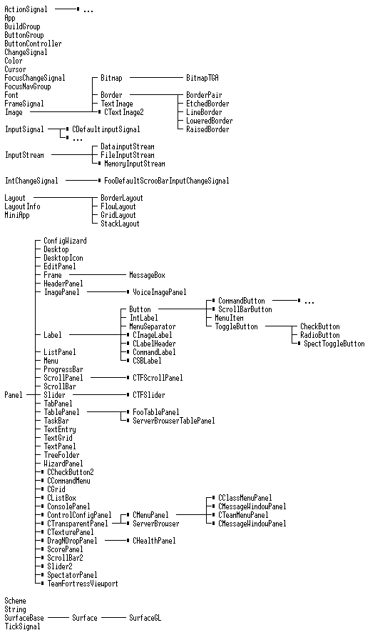
{ {
drawSetColor(40, 40, 200, 100); // r, g, b, alpha drawSetColor (40, 40, 200, 100); / / r, g, b, alpha
drawFilledRect(0, 0, getWide(), getTall()); drawFilledRect (0, 0, getWide (), getTall ());
} }
|
Как
видите, для рисования прямоугольника нужно вызвать две функции класса
Panel — установка цвета, и собственно, рисование прямоугольника.
As you can see, you need to draw a rectangle to call two functions in
the class Panel - Set the color, and in fact, draw a rectangle. Функции
getWide и getTall тоже являются частью класса Panel, и возвращают, как
вы уже наверное догадались, ширину и высоту панели. Functions and
getWide getTall are also part of the class Panel, and return as you may
have guessed, the width and height of the panel. Кстати,
имейте ввиду, что при рисовании прямоугольников во VGUI, третьим и
четвертым параметром вы задаете не высоту и шириру прямоугольника, как
это было в FIllRGBA, а координаты правой нижней точки. By the
way, keep in mind that when you draw rectangles in VGUI, third and
fourth parameter, you do not specify the height and shiriru rectangle as
it was in FIllRGBA, and the coordinates of the bottom right. То есть, команда drawFilledRect(50, 50, 70, 70) нарисует квадрат с длиной стороны 20 пикселей. That is, the team drawFilledRect (50, 50, 70, 70) draws a square with a side length of 20 pixels. Также не стоит забывать, что система координат для рисования относительна положения текущей панели. Also do not forget that the coordinate system for drawing the relative position of the current panel. И ещё один момент — чем меньше альфа, тем меньше прозрачность, а не наоборот. And one more thing - the smaller the alpha, the less transparency, rather than vice versa. Собственно, класс панели уже готов — осталось только подключить заголовок куда надо и создать объект класса. Actually, the class of the panel is ready - only need to connect the header to the right place and create a class object. В
первую очередь, где нибудь в классе TeamFortressViewport надо создать
переменную-указатель, которая будет указывать на наш объект, и через
которую к нему можно будет обратиться. In the first place,
somewhere in the class TeamFortressViewport need to create a pointer
variable that points to our facility, and through which it will be
available to address. Откройте описание класса (во vgui_TeamFortressViewport.h), и там в конце найдите коммент, гласящий "VGUI Menus".
Open the description of the class (in vgui_TeamFortressViewport.h), and
there in the end find the comments, stating "VGUI Menus". Вот после него и добавляем: That's after it and add: | CMyPanel *m_pMyPanel; CMyPanel * m_pMyPanel; |
Чтобы
компилятор не кидался в нас "undeclared identifier"ом, надо в начале
этого файла добавить "короткое" определение нашего класса. The
compiler did not rush us to "undeclared identifier" om, it is necessary
at the beginning of the file to add the "short" definition of our class. Найдите там ряд таких определений для уже существующих панелей, который выглядит примерно так: Find there a number of definitions for existing panels, which looks like this: ... ...
class Cursor; class Cursor;
class ScorePanel; class ScorePanel;
class SpectatorPanel; class SpectatorPanel;
class CCommandMenu; class CCommandMenu;
class CommandLabel; class CommandLabel;
... ... и т.д. etc.
|
и втисните туда упоминание нашего класса: and vtisnite there mention of the class: | class CMyPanel; class CMyPanel; |
Отлично, теперь шуруем в конструктор класса TeamFortressViewport, где мы, собственно, и создадим объект нашей панели. Ok, now Shura class constructor TeamFortressViewport, where we are, in fact, create an object to our panel. Пролистайте куда-нибудь в конец конструктора, где будут вызовы всяких "CreateTeamMenu", "CreateClassMenu", и там добавьте: Scroll somewhere in the end of the constructor, which will call any "CreateTeamMenu", "CreateClassMenu", and there add: m_pMyPanel = new CMyPanel(); m_pMyPanel = new CMyPanel ();
m_pMyPanel->setParent( this ); // подчинен TeamFortressViewport'у m_pMyPanel-> setParent (this); / / subordinate TeamFortressViewport'u
m_pMyPanel->setVisible( true ); // сразу включить m_pMyPanel-> setVisible (true); / / right turn
|
Чтобы
компилятор знал, что это за класс такой, надо где-нибудь в начале этого
файла (vgui_TeamFortressViewport.cpp) добавить включение нашего
заголовка. So the compiler knows that it is for a class, it is
necessary somewhere in the beginning of the file
(vgui_TeamFortressViewport.cpp) add include our header. Желательно добавить его после всех остальных. It is desirable to add it after the rest. | #include "vgui_MyPanel.h" # Include "vgui_MyPanel.h" |
 Ура, наше первое меню создано! Hooray, our first menu is created! Ура, наше первое меню создано! Hooray, our first menu is created!
Оно
не использует курсор мыши, появляется с самого начала игры, не имеет
бордюров и прочих украшательств, да и вообще выглядит как простой
квадрат. It does not use a mouse, there from the start, has no borders and other decorations, and generally looks like a simple square. Но даже такому супримату Малевич позавидовал бы :) But even such a suprimatu Malevich would envy :) У вас, наверное, возникает вполне закономерное желание как-нибудь разнообразить эту панель. You have, perhaps, there is quite a natural desire somehow diversify the panel. Можно с помощью рамочки сделать бордюр, и добавить ещё каких-нибудь прямоугольников. You can use frames to curb, and add anything else that rectangles. А можно и написать туда какой-нибудь текст. Or you can write some text there. Рисование текста — не очень сложная задача, которая, однако, требует понимания того, как VGUI работает со шрифтами. Drawing text - not a very difficult task, which, however, requires an understanding of how VGUI working with fonts. Поэтому давайте пока что отложим в сторону рисование, и попробуем разобраться в шрифтах. So for now let's leave aside the drawing, and try to understand the fonts.
Если внимательно присмотреться к таблице классов VGUI, то можно где-то в начале обнаружить такой неприметный с виду класс Font. If you look closely at the class table VGUI, you can find somewhere in the beginning of a nondescript-looking class Font. Этот класс обеспечивает загрузку и хранение шрифта. This class provides loading and storing font. Загружать
шрифт он может либо из tga-файла (по типу тех, что находятся в папке
gfx\vgui\fonts), либо из набора виндовских шрифтов, установленных в
системе. It can download a font from either tga-file (like those
that are found in the gfx \ vgui \ fonts), or from a set of enterprise
Windows fonts installed in the system. Во
втором случае, для шрифта можно указать произвольную высоту и ширину
символов, а также специальные параметры, типа "наклонный" и
"перечеркнутый". In the second case, you can specify a font for
an arbitrary height and width of characters, and special options, such
as "italic" and "crossed". Одного
взгляда на объявление конструктора класса Font достаточно, чтобы
понять, что это довольно простая для использования система — вы
передаете нужные параметры, и он делает всю работу. One look at
the Font class constructor declaration is enough to understand that it
is quite simple to use system - you pass the required parameters, and it
does all the work. Однако
нам, скорее всего, не придется самостоятельно загружать шрифты — в
клиентской библиотеке есть некий класс по имени CSchemeManager, который
может сделать эту работу за нас, а также проследить за корректным
удалением шрифта. However, we probably will not have to download
them - in the client library has a class called CSchemeManager, which
can make this work for us, and also to follow the correct removal of the
font. Подобно
классам CHud и TeamFortressViewport, класс CSchemeManager тоже является
синглетоном — всегда существует только один его экземпляр, который
можно получить через gViewPort->GetSchemeManager(). Like
classes and CHud TeamFortressViewport, class CSchemeManager also a
singleton - there is always only one instance of it, which can be
accessed through gViewPort-> GetSchemeManager (). Откуда CSchemeManager знает, какие шрифты надо загружать? Location CSchemeManager know which fonts to be loaded? Ответ на этот вопрос находится в файликах *_textscheme.txt, расположеных в папке valve или в папках других модов. The answer to this question lies in a file * _textscheme.txt, valve located in the folder or in folders other mods. Для
каждого разрешения существует такой текстовый файлик, который описывает
все существующие текстовые схемы и соответствующие им шрифты.
For each resolution, there exists a solution I've found a text that
describes all the existing schemes and the corresponding text fonts
them. Тут надо подробнее остановиться на разделении понятий "текстовая схема" и "шрифт". Here it is necessary to dwell on the separation of the concepts of "text outline" and "font". Каждой
текстовой схеме проставлен в соответствие свой шрифт, но помимо шрифта
она также может хранить набор настроек цвета для этой схемы, и набор
курсоров мыши. Each text pattern stamped in its own font, but the
font in addition it can also store a set of color settings for that
scheme, and a set of mouse cursors. Формат файлов схем довольно простой. The file format is quite simple circuits. Сначала идет имя описываемой схемы: The first is the name of the scheme described by: | SchemeName = "Basic Text" SchemeName = "Basic Text" |
Затем можно указать какой-нибудь шрифт, установленный в системе. You can then specify any font installed in the system. Он,
и его параметры, будут использованы только в том случае, если
SchemeManager не найдет соответствующего названию этой схемы tga-файла в
папке gfx\vgui\fonts. He and his options will only be used if
SchemeManager not find an appropriate name of this scheme tga-file in
the gfx \ vgui \ fonts. FontName = "Arial" FontName = "Arial"
FontSize = 17 // высота букв FontSize = 17 / / height of the letters
FontWeight = 0 // толщина линий (значение 700 аналогично параметру bold) FontWeight = 0 / / line thickness (value 700 implies a bold) |
Затем
по желанию можно указать дополнительные параметры цвета (конечно,
только если код, выводящий этот текст на экран, их использует)
Then, if desired, you can specify additional options of color (of
course, only if the code that displays the text on the screen, use them) FgColor = "255 170 0 255" FgColor = "255 170 0255"
FgColorArmed = "255 255 255 255" // при наведении курсора FgColorArmed = "255255255255" / / when the cursor
FgColorMousedown = "255 255 255 255" // при нажатии мыши FgColorMousedown = "255255255255" / / in the mouse |
Теперь давайте посмотрим на это дело изнутри. Now let's look at the matter from the inside. Если
вас интересует рутина парсинга файлов со схемами, и загрузка шрифтов,
то можете заглянуть в конструктор класса CSchemeManager — оно всё
находится там. If you are interested in parsing routine with the
schemes and download fonts, you can go to the class constructor
CSchemeManager - it is all there. Кстати,
если вы всё-таки надумаете отказаться от услуг менеджера схем, и решите
самостоятельно загружать шрифты, то учтите, что в отличии от панелей,
удаление которых происходит автоматически, объекты шрифтов надо удалять
вручную. By the way, if you do decide to cancel the service
manager's schemes and decide to download them yourself, keep in mind
that, in contrast to the panels, the removal of which is automatic font
objects have to be removed manually. Под "изнутри" я больше подразумевал то, как получить у менеджера схем нужный шрифт и его настройки. Under the "inside" I meant more than how to get the manager of schemes desired font and font settings. Делов тут, оказывается, всего на три строчки: The matter here, it turns out, only three lines: // получаем указатель на менеджер схем / / Get a pointer to the layout manager
CSchemeManager *pSchemes = gViewPort->GetSchemeManager(); CSchemeManager * pSchemes = gViewPort-> GetSchemeManager ();
// получаем номер схемы с заданным именем / / Get the number of the circuit with the specified name
SchemeHandle_t hTitleScheme = pSchemes->getSchemeHandle( "Title Font" ); SchemeHandle_t hTitleScheme = pSchemes-> getSchemeHandle ("Title Font");
// получаем шрифт по номеру / / Get the font number
Font *pTitleFont = pSchemes->getFont( hTitleScheme ); Font * pTitleFont = pSchemes-> getFont (hTitleScheme); |
Вуаля! Voila! pTitleFont теперь указывает на нужный нам шрифт, и мы с ним можем делать что угодно. pTitleFont now points us to the desired font, and he and I can do anything. Мда, кстати, а что нам с ним делать-то?... Hmm, by the way, what do we do with him, then? ... Весьма
своевременный вопрос — ведь теперь мы всё знаем о том, как загружать
шрифты, и настало время разобраться, как всё-таки вывести на экран
текст. A very timely question - now we all know how to download them, and it's time to figure out how to still display the text. В
поисках функций рисования текста, идём в уже знакомый нам "набор
художника" — а именно, копаемся в наборе draw-функций класса Panel.
In search functions to draw text, go to the already familiar "set of
the artist" - namely, delve into the set of draw-functions of class
Panel. И находим аж целую кучу функций для вывода текста: And as much as we find a whole bunch of functions for text output: void drawSetTextFont(Font* font); // установить шрифт void drawSetTextFont (Font * font); / / set the font
void drawSetTextColor( int r, int g, int b, int a); // установить цвет void drawSetTextColor (int r, int g, int b, int a); / / set the color
void drawSetTextPos( int x, int y); // установить координаты void drawSetTextPos (int x, int y); / / set the coordinates
void drawPrintText( const char * str, int strlen); // напечатать строку void drawPrintText (const char * str, int strlen); / / print a string
void drawPrintChar( char ch); // напечатать символ void drawPrintChar (char ch); / / print the character |
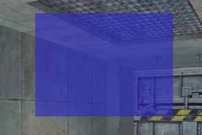
 Ну как тут не разгуляться :) Срочно бежим в наш класс CMyPanel, и переписываем функцию paint так, чтобы испытать новые игрушки. Well then do not roam :) Urgent run in our class CMyPanel, and rewrite the function of paint so to experience new toys. Заодно побалуемся прямоугольниками и рамочками. At the same time indulged boxes and frames. Лично у меня получилась вот такая вот скромная панелька: Personally, I got this here humble socket: Ну как тут не разгуляться :) Срочно бежим в наш класс CMyPanel, и переписываем функцию paint так, чтобы испытать новые игрушки. Well then do not roam :) Urgent run in our class CMyPanel, and rewrite the function of paint so to experience new toys. Заодно побалуемся прямоугольниками и рамочками. At the same time indulged boxes and frames. Лично у меня получилась вот такая вот скромная панелька: Personally, I got this here humble socket:
А вот и код её функции рисования: And here is the code for its drawing functions: void CMyPanel::paint() void CMyPanel :: paint ()
{ {
// Получаем указатель на шрифт, которым мы будем выводить текст / / Get a pointer to the font, which will output the text
CSchemeManager *pSchemes = gViewPort->GetSchemeManager(); CSchemeManager * pSchemes = gViewPort-> GetSchemeManager ();
SchemeHandle_t hTitleScheme = pSchemes->getSchemeHandle( "Title Font" ); SchemeHandle_t hTitleScheme = pSchemes-> getSchemeHandle ("Title Font");
Font *pTitleFont = pSchemes->getFont( hTitleScheme ); Font * pTitleFont = pSchemes-> getFont (hTitleScheme);
// Рисуем верхнюю заливку / / Draw the top of the fill
// Обратите внимание, что её размер основан на высоте букв шрифта! / / Note that it is based on the size of the lettering font!
drawSetColor(20, 70, 30, 100); drawSetColor (20, 70, 30, 100);
drawFilledRect(0, 0, getWide(), pTitleFont->getTall() + YRES(4)); drawFilledRect (0, 0, getWide (), pTitleFont-> getTall () + YRES (4));
// Рисуем заливку основного пространства / / Draw fill the main space
drawSetColor(40, 150, 60, 150); drawSetColor (40, 150, 60, 150);
drawFilledRect(0, pTitleFont->getTall() + YRES(4), getWide(), getTall() - YRES(10)); drawFilledRect (0, pTitleFont-> getTall () + YRES (4), getWide (), getTall () - YRES (10));
// Рисуем нижнюю заливку. / / Draw the bottom of the fill.
drawSetColor(20, 70, 30, 100); drawSetColor (20, 70, 30, 100);
drawFilledRect(0, getTall() - YRES(10), getWide(), getTall()); drawFilledRect (0, getTall () - YRES (10), getWide (), getTall ());
// Выводим текст / / Display the text
drawSetTextFont(pTitleFont); drawSetTextFont (pTitleFont);
drawSetTextColor(250, 250, 250, 40); drawSetTextColor (250, 250, 250, 40);
drawSetTextPos(XRES(10), YRES(2)); drawSetTextPos (XRES (10), YRES (2));
drawPrintText("bla-bla-bla", 11); // 11 - длина строки drawPrintText ("bla-bla-bla", 11) / / 11 - length of string
// Рисуем рамку вокруг панели / / Draw a frame around the panel
drawSetColor(0, 0, 0, 70); drawSetColor (0, 0, 0, 70);
drawOutlinedRect(0, 0, getWide(), getTall()); drawOutlinedRect (0, 0, getWide (), getTall ());
} } |
Класс
Font позоляет также узнавать различные характеристики хранимого внутри
шрифта, типа высоты и ширины букв, что можно использовать для
автоматической подгонки размера элементов, как это сделано тут в строке
заголовка. The Font class enables singles also recognize the
different characteristics of the stored inside the font, such as the
height and width of the letters that you can use to automatically fit
the size of the elements, as is done here in the title bar. Еще одной новенькой функцией здесь является drawOutlinedRect — как вы, наверное, догадались, это рисование рамки. Another brand new feature here is the drawOutlinedRect - as you probably guessed, is drawing frame. Of
course, you do not have such makarom draw all the buttons and other
elements of your menu - in VGUI already have a lot of ready-made
elements that will draw themselves, as it should be. Nevertheless,
to have an idea about how to draw "by hand" is still needed - sometimes
it can even be a simpler solution than digging in ready-made
components.
Working with images is somewhat similar in font - there is a class Bitmap, which serves as the loading and storage of images. As a rule, the Bitmap class is used instead of a descendant BitmapTGA, who can download the TGA-files. Objects of these classes, as well as fonts, should be removed. But
if the fonts that work done CSchemeManager, then there is no such
mechanism, and so we will have in our panel to create a class
destructor, from which we will produce the removal of downloaded images. The class Font, as we recall, was quite convenient constructor where once it was possible to specify the file name. If vglyanut on the class constructor BitmapTGA, we will see that it takes a rather strange argument: | BitmapTGA (InputStream is *, bool invertAlpha); |
InputStream - this is another muddied Valvo, poured into what we still need to open the image file. However, at each Valvo has muddied its functions, simplifying it :). For easy image upload, there are two functions that can be found in the file vgui_loadtga.cpp: BitmapTGA vgui_LoadTGA * ( const char * pFilename)
BitmapTGA vgui_LoadTGANoInvertAlpha * ( const char * pFilename) |
int iarray[10]; int iarray [10];
int iNumsLoaded = 0, / / counter numbers loaded
char token [1024]; char * pfile = gEngfuncs.COM_LoadFile ("numbers.txt", 5, NULL); if (pfile)
{ {
/ / If the file is loaded
char * pText = pfile; / / do not touch pfile, you will need it when you close the file
for (iNumsLoaded = 0; iNumsLoaded <10; iNumsLoaded + +)
{ {
pText = gEngfuncs.COM_ParseFile (pText, token); / / read the next word
if (! strlen (token))
Break; / / unexpected end of file
iArray [iNumsLoaded] = atoi (token); / / convert to a number and write to the array
} }
gEngfuncs.COM_FreeFile (pfile); / / unload file
} } |
As you can see, it's pretty simple.
Reading
lines from a file titles.txt carried out on the same principle - you
set the message name, it is searched for in the file and if it is found,
it is written in the buffer provided by you. If it is not found, then you will get your same line. In class CHudTextMessage for this there are two quite convenient features: char * LocaliseTextString ( const char * msg, char * dst_buffer, int BUFFER_SIZE) char * BufferedLocaliseTextString ( const char * msg)
|
Functions are static, i.e. you do not need an object of class to their cause.
first
function takes a pointer to a string containing the names of the
messages, and the buffer where it should record the results. You also need to specify the size of the buffer that the function it does not accidentally exceeded. Message names in the string must begin with a '#' to feature distinguishes them from regular text. For
example, if the line with the message name is "# T0A0TITLE", it means
that, according to records in titles.txt, in the result buffer will be
the text "HAZARD COURSE".
Consider a more complex line: | "Employes of the month: # CR1, # CR3, and # CR4" |
In this case, all the names of messages CR1, CR2, and CR3 are replaced
by the corresponding record in the file, and as a result we obtain: | "Employes of the month: Ted Backman, Kelly Bailey, and Yahn Bernier" |
Интересно, не правда ли? Interesting, is not it? :) :)
Now let's look on the part function. It is a simplified version of the first - not in the sense that it does less work, and that it is more convenient to use. She is in a static buffer size of 1024 characters, where it places the extracted string and returns a pointer to it. Of
course, you have to process the result to the next call to this
function, as its internal buffer will be overwritten with the new line. The conclusion from this is as follows: LocaliseTextString useful if you want to keep your clipboard for later use. If
you just need to create a temporary buffer to get the result, process
and throw, then BufferedLocaliseTextString fits in very handy.
Well, already bored by all sorts of things that you can pull, and poke your arm? :) Yes, indeed, we have time to figure out something that will respond to our overtures mouse. I
must say that of all the controls, I will not tell, just take a walk
briefly on the basic, such as normal and scrollable text field, various
kinds of buttons, and of course the pictures. So from this moment we begin to consider VGUI menu, responding to mouse, we therefore need a mouse. Manages the cursor function of class UpdateCursorState TeamFortressViewport. It checks for a menu that requires a mouse, and if one is, then install it. Otherwise - removes.
fukntsii Open this at the outset, pay attention to this long line: | if (m_pSpectatorPanel-> m_menuVisible | | m_pCurrentMenu | | m_pTeamMenu-> isVisible () | | ... etc.) |
We need to include in your menu this condition. Change the beginning of conditions such as: | if (m_pMyPanel-> isVisible () | | ... on the rest) |
That's
it, now there was only one problem - UpdateCursorState function is not
called directly on the load level (in theory at all, it should be called
immediately after any action by closing or opening panels). On
it you can find a temporary solution - just at the end of the class
constructor TeamFortressViewport (certainly after the establishment of
our panel!) Add a call to this function. Then, when the
display of your menu has to be managed message of, or anything else, do
not forget to call UpdateCursorState () and hide after the opening
panel.
To add a control to the class of your menu much like the addition of the menu in the class TeamFortressViewport. Usually,
your class is added to a pointer variable, through which you can apply
to this element, and the element is created in the constructor of your
panel. We can only relate it to your panel and "related"
links via setParent, and ready - he will be painted, and respond to user
input. Well, let's take the example conventional button. From the library VGUI class is responsible for the button Button. Step number one - to go to the description of the class of our panel (CMyPanel), and add the new index. Now our class is as follows: class CMyPanel: Public Panel
{ {
Public :
CMyPanel (); / / constructor
Virtual void paint (); / / draw function
Button * m_pButton; / / pointer to the button-
}; }; |
Step number two - go to the constructor function, and add the lines to create a new button. Now it looks like this: CMyPanel::CMyPanel() : Panel(XRES(100), YRES(100), XRES(200), YRES(150)) CMyPanel :: CMyPanel (): Panel (XRES (100), YRES (100), XRES (200), YRES (150))
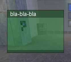
{ {
m_pButton = New Button ("Cool Button", XRES (25), YRES (15));
m_pButton-> setParent ( this ); / / set the submission of the panel
setPaintBackgroundEnabled ( false ); / / disable call paintBackground
} } |
 That's it, the button is created. Look at it - why not a cool button? :) (As you can see, I removed all of the functions of paint, and made a simple dark shading and a black border) That's it, the button is created. Look at it - why not a cool button? :) (As you can see, I removed all of the functions of paint, and made a simple dark shading and a black border)
So far, this button does nothing, and when you only have fun winks. How
to teach a button to run some things, I will tell when we get to the
event handlers, and until then, just do about the pacifier button. Not that the event handlers were somewhat complicated, just all the time.
When
we care about the appearance of their own panels, we can certainly draw
the background and border manually using the fill and the rectangle. However,
the application of this method becomes quite difficult when it comes to
setting up the form kakih-nibud added to your panel controls. There
are a couple of functions of class Panel, which allow to create the
background and border for the right panel, without resorting to the
"artist's toolbox." On the background I mentioned when talking about the version of the default function paintBackground. To set the background color of the panel should simply call | void setBGColor ( int R, int G, int b, int A); |
For this to work, you should not override your class paintBackground,
and not to disconnect a call to it (ie, the team
setPaintBackgroundEnabled (false) of the previous examples now use is
not necessary. Should also remove the code for drawing the background
and borders, we piled in paint).
Set
the border for the panel is not particularly complicated than the
background color, but there is a difference in the concept. Take a look at the table of classes and find the Image, and then inherits the class Border. He has five children, and objects of any of them may act as drawing a border for the panel. This is done so - the object is created and then assigned to the panel via the function setBorder. Here are a couple of examples: / / Create a thick black frame pixel
setBorder ( New LineBorder); / / create a dark red frame thickness in three pixels setBorder ( New LineBorder (3, Color (100, 20, 20, 50)));
|
No need to worry about removing objects borders - the panel will remove them automatically. Some borders, like LineBorder, there are constructors that allow you to set the parameters of the border. To use a curb, you need to include the header file named "VGUI_imya-bordyura.h"
Under the text fields I mean the panel that serve to display text in them. Although I am told how to draw the text manually from the function paint, but it was rather a secondary purpose. In practice, this drawing text formatting, or, especially, text, scrolling the mouse would become a torment. Therefore it will be a sin not to use ready-made components that all work has been done for us. I will look at three main components enable you to display text. Это: They are:
1) TextPanel - a panel with the text.
2) ScrollPanel - the same thing, only able to scroll the mouse.
3) Label - "label" - a one-line text box provided, usually for titles and captions.
As we remember, adding a new element to the panel starts with a pointer variable for it. Add to our class a variable: | TextPanel * m_pTextPanel; |
(In fairness it should be noted that this index is only needed if we
are going to refer to an object after it is created. If this is a static
element, whose properties during the game you are not going to change,
then you can do without a pointer - the main object to be associated
with Our panel setParent'om) Then, go to the Dashboard Designer, where we will create the object itself. (The button in the previous example I removed so as not to interfere, as well as some increased panel) # Define STEPX XRES (10) # define Stepy yRes (10) CMyPanel CMyPanel :: (): Panel (XRES (100), YRES (100), XRES (300), YRES (204))
{ {
char * pfile = ( char *) gEngfuncs.COM_LoadFile ("testtext.txt", 5, NULL); if (pfile)
{ {
m_pTextPanel = New TextPanel (pfile, STEPX, Stepy, getWide () - STEPX * 2, getTall () - STEPY * 2);
m_pTextPanel-> setParent ( this );
m_pTextPanel-> setPaintBackgroundEnabled ( false ); / / disable drawing the text background
gEngfuncs.COM_FreeFile (pfile);
} }
setBgColor (0, 0, 0, 200); / / color of the panel
setBorder ( New LineBorder); / / border
} } |
 Designer
TextPanel takes a pointer to the text, which it will display as well as
standard options for most panels - the coordinates and dimensions. This text pane loads the text from the file testtext.txt, located in the folder mode. As you can see, this is no big deal, since the panel will copy the text in its internal buffer, allowing us to close the file. Designer
TextPanel takes a pointer to the text, which it will display as well as
standard options for most panels - the coordinates and dimensions. This text pane loads the text from the file testtext.txt, located in the folder mode. As you can see, this is no big deal, since the panel will copy the text in its internal buffer, allowing us to close the file.
Text
panel has the same function draw the background (paintBackground), as
the class Panel, so if I did not shut off, it would be drawn on top of
another fill below the text. In principle, it can not be turned off and using the setBgColor ask some nice color - your business. Needless, TextPanel gives you the ability to customize the font and text color. For
this purpose, function and setFont setFgColor - see the description of
the format of the class, there is, in principle, everything is clear.
In TextPanel simply show the text is cut off at the edges, not vozvolyaya us in any way to see it continue. To create a scrolling text, it is necessary to use the services of class ScrollPanel. You would think that ScrollPanel - it's the same TextPanel, which, perhaps, is able to scroll, but it's not. In fact, ScrollPanel - it's just a shell with a scroll bar, in which you are required to insert a panel. Imagine
what it gives the opportunity - because you can not just shove back
panel with the text, as well as panels with headlines and pictures. ScrollPanel,
addition of scroll bars, incorporates two further panels - one
conventionally called "ClientClip", and defines a square window, through
which we see the information, and the second is called a "Client", and
is within ClientClip (i.e., subordinated s), and it moves along with the
movement of scroll bars. Client has, in turn, is subordinate to our panel, we add to the ScrollPanel. Well, let us make a scrolling text box. To this end, in addition to the object ScrollPanel, will also create TextPanel, and put it under the client panel ScrollPanel. The stumbling block in this task can be a compilation of the correct size for the text panel. Or rather, we need to size the text pane depends on the actual amount of text in it, and was not set at random. Otherwise,
we get so that no scroll bars adjust to the text, and the text adjusts
to the area allotted to him :) And that, you see, is not entirely
correct. In general, look at an example of how to create a scroll bar, and then from then on it will become clear. Throw out all of our design, and use the following code (optional m_pScrollPanel adding a variable in our class): # Define STEPX XRES (10) # define Stepy yRes (10) CMyPanel CMyPanel :: (): Panel (XRES (100), YRES (100), XRES (300), YRES (204))
{ {
char * pfile = ( char *) gEngfuncs.COM_LoadFile ("testtext.txt", 5, NULL); if (pfile)
{ {
/ / Create the scroll bar and assign the subordination of our panel.
m_pScrollPanel = New ScrollPanel (STEPX, Stepy, getWide () - STEPX * 2, getTall () - STEPY * 2);
m_pScrollPanel-> setParent ( this ); / / Assign the frame to scroll bar m_pScrollPanel-> setBorder ( New LineBorder (Color (0,0,0,50))); / / Specify dip scroll bars when Call the calculation of ClientClip m_pScrollPanel-> validate (); / / Create a text pane and assign the client submission panel ScrolPanel'a. / / Horizontal Size - the size of the ClientClip. / / Vertical size - any. TextPanel * text = New TextPanel (pfile, 0, 0, m_pScrollPanel-> getClientClip () -> getWide (), 64); text-> setParent (m_pScrollPanel-> getClient ()); text-> setPaintBackgroundEnabled ( false ); / / get the dimensions of space, actually occupied by text int iScrollSizeX, iScrollSizeY; text-> getTextImage () -> getTextSizeWrapped (iScrollSizeX, iScrollSizeY); / / assign these sizes the text bar text-> setSize (iScrollSizeX, iScrollSizeY); / / Call to recalculate the parameters ScrollPlanel. m_pScrollPanel- > validate (); gEngfuncs.COM_FreeFile (pfile);
} }
setBgColor (0, 0, 0, 200); / / color of the panel
setBorder ( New LineBorder); / / border
} } |
 Well, let's get it right. First, we create an object and assign it a ScrollPanel border - well, this is, in principle, everything should be clear. Next comes the challenge of several functions that are specific to the class ScrollPanel. You can make the scroll bars are always visible or visible only when the text extends beyond the scroll area. Function validate makes ScrollPanel ClientClip calculate area for a given panel size, and set the options for the strips. As a rule, it should be called after updating the contents of a scroll, or a change in the size of ScrollPanel. Well, let's get it right. First, we create an object and assign it a ScrollPanel border - well, this is, in principle, everything should be clear. Next comes the challenge of several functions that are specific to the class ScrollPanel. You can make the scroll bars are always visible or visible only when the text extends beyond the scroll area. Function validate makes ScrollPanel ClientClip calculate area for a given panel size, and set the options for the strips. As a rule, it should be called after updating the contents of a scroll, or a change in the size of ScrollPanel.
The next step is we create a text panel. Coordinates set 0, 0 - we do not need any surprises. The horizontal size of the panel so ask what, in our opinion, should not exceed the width of the text. If
we do not want the horizontal scroll bar appears, then we substitute
here the width ClientClip - in this case, the text will never crawl out
of the window width, and the words do not fit will be wrapped to the
next line. The height of the text pane can be put proizolnoy - still then make a recalculation under the actual size of the text. The
final step in the creation of the panel with a scrollable text - it fit
the size of the text pane under real proschad required text. TextPanel contains within itself another object with which we were not previously acquainted - TextImage. You can reach it by calling getTextImage (). Not
to say that it gives us a lot of good, but in this particular case, it
may be useful, because this TextImage just can calculate the footprint
of the text. You just need to call its function getTextSizeWrapped, and it will return the horizontal and vertical dimensions. Width
is bound to be less than the width of the text pane, which we pointed
out in its constructor, but the height is entirely dependent on the
amount of text. At the end of all, you need to call again to validate the scroll bar to make it all correctly perceived and calculated. Yes, I also have a feeling that something is missing. Buttons have scrollbars strange - no arrows. ScrollPanel design is such that it comprises two subordinate object ScrollBar, and each of them - one Slider'u and two buttons. We can easily access all of this farm and customize its appearance as we please. You
are, I think, drew attention to the fact that the view we create
buttons and scroll bars are not quite like the usual VGUI-button with
green frames are highlighted in orange. The fact that we
use the components of a set of libraries VGUI, and in all modes, such
TeamFortress or Counter-Strike, used special versions of these objects,
made purely for TeamFortress. Glancing at the table of classes, you can easily find various classes created on the basis of VGUIshnyh. For
example, the Button is procreation as a CommandButton or
SpectToggleButton, and ScrollPanel and Slider have TeamFortress-version
called CTFScrollPanel and CTFSlider. You can experiment with the above code, and instead substitute ScrollPanel CTFScrollPanel. The green scroll bar, but without the buttons, as necessary for them to TGA-files with no arrows. So where was I? Oh yeah, we wanted to make arrows. ScrollPanel
version by default though and creates a button, but does not assign
them pictures, prepolagaya that will do it ourselves. Fortunately, there is a folder lying some TGA-I've found the arrows kootrye it is possible to accommodate. To do this, after creating ScrollPanel add only two lines: You may ask - but perhaps we should not remove the object BitmapTGA, which creates a function vgui_LoadTGA? I will answer in this case - will take care of the button itself. The
fact is that if you assign a picture to any object through the function
setImage (which exists in the class Label and, accordingly, all its
descendants), then from that moment he takes on the responsibility for
its removal. In fact, it does the same thing that we
learned in the chapter "Working with Images" - calls for her doPaint and
removes a destructor.
I would recommend you study the code and classes CTFScrollPanel
CTFSlider - this will give a very clear examples of how you can create a
unique scroll box, looking in their own way.
Zakanichivaya talk about prokruchivamyh panels, I want to make a small comment on the code above. If suddenly the desired file will not appear on the disc, the text panel does not appear. Maybe
sometime this behavior would be the best, but sometimes it's better to
make a plate was inserted "default text" (for example, something like
"Can't load description file"). Here is a small piece of code - I think, after reading it, you will understand the basic idea. char * pfile = NULL; char * pText = "Can not load description file"; pfile = gEngfuncs.COM_LoadFile ("testtext.txt", 5, NULL); if (pfile) pText = pfile;
... ...
... ... Next, load the text pane, using the text on the sign ptext
... ...
if (pfile)
gEngfuncs.COM_FreeFile (pfile); |
You
can certainly make a more complex system, which in the absence of the
file will not create a panel and replace it with something .. Well, in general, at your discretion.
 We have one more unconsidered element for working with text - this Label (label). Usually Label - a one-line test that is used to create headers and signatures. By
the way, the buttons are inherited from Label'a, as they too, in fact,
consist of a single line of text, only with more heaped drawing code. We have one more unconsidered element for working with text - this Label (label). Usually Label - a one-line test that is used to create headers and signatures. By
the way, the buttons are inherited from Label'a, as they too, in fact,
consist of a single line of text, only with more heaped drawing code.
Create
a label is as simple as plain text panel - specify the size, hectic
there the text, expose the color and font, and specify the alignment -
left, right, top, center, and so on. Here's the code to
create a header that will grace our panel (as well as all those who have
not guessed, tells the name of the song and the name of the author :))
/ / Get the font for headings
CSchemeManager pSchemes * = gViewPort-> GetSchemeManager ();
SchemeHandle_t hTitleScheme = pSchemes-> getSchemeHandle ("Title Font");
* Font = pTitleFont pSchemes-> getFont (hTitleScheme); int = labelsize pTitleFont-> getTall () + YRES (4) / / calculate the height of the label / / Create the label / / Its height depends on the height of the letters in the font * plabel Label = New Label ("", STEPX, Stepy, getWide () - STEPX * 2, labelsize ) -plabel> setParent ( this ); plabel-> setFont (pTitleFont); plabel-> setBGColor (0, 0, 0, 190) / / background color plabel-> setFgColor (255, 255, 255, 0) / / text color plabel-> setContentAlignment (Label :: a_center); / / centered plabel-> setText ("Muddasheep: Halfquake");
|
Also worth little to correct the coordinates of the panel with a
scrollable text, so they do not steal over each other, and we get a
result like to vysheprimedennoy illustration.
When we started talking about the controls, I already showed you how to create a basic button. So I will not repeat itself, but instead to finally talk about how to get the button to respond to touch. In many systems to provide the feedback mechanism of callbacks - that is, the object you pass a pointer to a function that he should call upon the occurrence of certain events. In
VGUI as intense ispolzutsya object-oriented design - you pass a pointer
to another object, the virtual function to be called when the event
occurs. So,
the event handler is an object that contains a function that will be
called if the event being handled (I hope you do not feel sick from the
words of a function object-event :)). In VGUI there are several types of processors, and so far we analyze the event handlers for the buttons. All handlers of this type inherit from ActionSignal. It consists of only one function, and the code I can give you right here: class VGUIAPI ActionSignal
{ {
Public : Virtual void actionPerformed (Panel panel *) = 0;
}; }; |
Actually, when you create a new event handler, our goal is to change only function actionPerformed. And, of course, if necessary, will also need to add some variables and, for greater comfort, the designer. The pointer passed to the actionPerformed - a pointer on the button. Let's write a simple event handler (although they all are, in most cases, unpretentious), which will be closing our window. class CMyHandler: Public ActionSignal
{ {
Private :
Panel * pOwner; Public : CMyHandler (Panel * Owner)
{ {
pOwner = owner;
} }
void actionPerformed (Panel * panel)
{ {
pOwner-> setVisible ( false );
gViewPort-> UpdateCursorState ();
} }
}; }; |
In this class, the handler has one variable - pOwner. It stores a pointer to the parent panel, which we passed in the constructor when creating the handler. ActionPerformed function hides this panel, and makes TeamFortressViewport update the status of the mouse cursor. (By the way, do not forget that the cover panel and remove the panel - two different things). Now, in our previous window to add the button itself: int butx, Buty;
m_pButton = New Button ("Okay", 0, 0);
m_pButton-> setParent ( this );
m_pButton-> getSize (butx, Buty);
butx getWide = () - butx - STEPX;
Buty = getTall () - Buty - Stepy;
m_pButton-> setPos (butx, Buty);
m_pButton-> addActionSignal ( New CMyHandler ( this )); |
In
the last line we create our object handler, passing it to the
constructor a pointer to the main panel (this), and using the
addActionSignal tie it to the button. The removal, again, no need to worry - the buttons themselves removed their handlers. At the base VGUIshnoy button has one advantage - she can calculate its size based on the space occupied by text. Here
I want to put the button in the lower right corner of the panel, so
after I created a button, I need to know her resulting dimensions. The
final button coordinates are obtained by the formula: coord = panelSize
- buttonSize - offset, where the offset - this is offset from the edge
of the panel. Of course, we again need to fix the size of the scroll bar. I have this code, it has created: | ... New ScrollPanel (STEPX, labelsize Stepy + * 2, getWide () - STEPX * 2, buty - (labelsize + STEPY * 3)); |
 When calculating the size I rely on the already computed the size of the header and buttons. Thus, no matter what size they are, the panel will always look right. When calculating the size I rely on the already computed the size of the header and buttons. Thus, no matter what size they are, the panel will always look right.
As always, I cite the frame. Perhaps you Muddaship was confused, so I changed the plate :) When you press the button, as planned, the panel closes with a whistle, the cursor disappears and we can run as usual. To
show our panel again, it is necessary to call from somewhere
gViewPort-> m_pMyPanel-> setVisible (true), and then
UpdateCursorState. Where does this cause - this, of course, up to you. You
can create a message of, or EVENT, and his reception display panel (the
creation of Event and message of this article is not considered) The table in front of classes ActionSignal I put three dots - which means that he has a lot of descendants (about twenty). Among
them are closing the menu (though not the same as ours), and perform a
shell command, and switching values cvar'ov (console variables), etc. If you need examples, just type in the search MSVC string "public ActionSignal". There is one trick to event handlers, which I must say. Sometimes doing so, that she is the main panel and the event handler. Here
we are faced with a term such as multiple inheritance - that is, the
class of our panel and both inherited from the Panel, and from
ActionSignal, and, accordingly, among other functions, and contains
actionPerformed.Выглядит это примерно так: It looks like this: class CMyPanel: Public Panel: Public ActionSignal
{ {
Public :
CMyPanel ();
~ CMyPanel (); void paint (); void actionPerformed (Panel * panel); Button * m_pButton; ScrollPanel * m_pScrollPanel;
}; }; |
Sootetstvenno, add an event handler button, we'll be like: | m_pButton-> addActionSignal ( this ); |
ActionPerformed function will do the same, but now look to be a little easier: void CMyPanel :: actionPerformed (Panel * panel)
{ {
setVisible ( false );
gViewPort-> UpdateCursorState ();
} } |
That is, in principle, so you can do without creating additional classes to handle the event button. Of course, this is only the case if the control panel is fairly simple, as in the above case. Well, we assume that the reaction to pressing we understand.
Standard
white-orange button, of course, is suitable to be trained on it, but,
in the end, it is only the source code, which means that it will
establish a normal button. As such, it can not be used for
several reasons - first, its colors can not be set (you can only change
the color of the text through setFgColor, but that is not property of a
button, and the class Label), secondly, the backlight press looks purely
schematically , well, thirdly, it has a small bug with lighting - if
you hold the mouse button to take her and let go, the backlight will
remain. In principle, nothing prevents us to take advantage
of TeamFortress'ovskoy button CommandButton - is familiar with the key
frame and highlighting when the mouse. She is still about
fifteen children, of which, however, is unlikely to be anything useful
for you - they are mainly designed for times TeamFortress (for example,
some visible only for one command, etc.). I did not draw them in the class table, and simply put the ellipsis. But
the best option is not to tear up the buttons of TeamFotress (which
everyone already rubbed a blister on the eyes), and make your own. At the end of reading this article for you it will not be a problem. After
all, you already know how to use manual features drawing, and it
remains only to find out some details of processing signals from the
mouse and Claudia, who will be treated in the same section. Now for example, I'll show you how you can simply alter the appearance of the button. As you know, the button class inherits directly from class Label, which is in the paint draws text. The
button also draws its background in paintBackground, which is very
convenient - we can without touching the drawing of the text, drawing
remake of the button. class CMyButton: Public Button
{ {
Public : / / empty constructor CMyButton ( const char * text, int x, int y): Button (text, x, y) {}; Virtual void PaintBackground ()
{ {
int R, G, b, A;
getBgColor (R, G, b, A); / / get the specified background color
drawSetColor (r, g, b, 0);
drawFilledRect (0, 0, getWide (), getTall () ) / / paint the background
/ / button simulates a bulge in the normal state, and
/ / embedment pressing.
if (isSelected ())
{ {
drawSetColor (255, 255, 255, 70);
drawOutlinedRect (0, 0, getWide () -1, getTall () -1); drawSetColor (0, 0, 0, 70); drawOutlinedRect (1, 1, getWide () , getTall ());
} }
else
{ {
drawSetColor (0, 0, 0, 70);
drawOutlinedRect (0, 0, getWide () -1, getTall () -1); drawSetColor (255, 255, 255, 70); drawOutlinedRect (1, 1, getWide () , getTall ());
} }
/ / Bounding box.
drawSetColor (R / 2, g / 2, b / 2, 0);
drawOutlinedRect (0, 0, getWide (), getTall ());
} }
}; };
|
And do not forget to create indicate color: m_pButton-> setBgColor (30, 100, 30, 0) / / background color
m_pButton-> setFgColor (255, 255, 255, 50) / / text color |
 That such we would get a button, which also mimics utaplivaemost when pressed, like a normal button windows. Agree, is a progress compared with the base-click :). That such we would get a button, which also mimics utaplivaemost when pressed, like a normal button windows. Agree, is a progress compared with the base-click :).
In
VGUI there are two types of buttons: radio buttons and check boxes
(both inherited from ToggleButton, which is the ancestor of the already
familiar Button). Radio buttons - these are the circles with labels tend to combine in a group, from which you can choose only one. Flags - it squares with crosses or ticks either. The standard library VGUI these elements are responsible for the RadioButton class and CheckButton respectively. If
the look of their description, you will see that there is nothing
there, except for the drawing functions and a couple of designers, who
have the same form as the constructors Button. I have one specific radio buttons - one should be divided into groups, otherwise they do not make any sense. There is a class called ButtonGroup, which is a logical container for a group of radio buttons. I call it logical because ButtonGroup is not a panel, and does not render - ie if you want a box around a group of radio buttons, you have to draw it yourself. From the above it follows that the ButtonGroup objects are not removed automatically, and their removal should take care to us. Snap
button to a particular group is pretty simple - just call her and
setButtonGroup function as an argument to pass a pointer to an object
ButtonGroup. 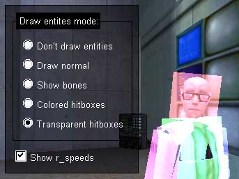 All of the buttons is the status selected, which you can learn the function isSelected. The only difference is, in principle, according to which button is currently set this status. Normal buttons are in this status when the user grips it with the mouse. Switch boxes that status of clicks (check mark in the box lights up and then disappears). Of
all the radio buttons in the group, only one of them has the status of
selected included - the one that the user last poked the mouse. All of the buttons is the status selected, which you can learn the function isSelected. The only difference is, in principle, according to which button is currently set this status. Normal buttons are in this status when the user grips it with the mouse. Switch boxes that status of clicks (check mark in the box lights up and then disappears). Of
all the radio buttons in the group, only one of them has the status of
selected included - the one that the user last poked the mouse.
Events from the radio buttons and check boxes are treated the same as the usual buttons - with ActionSignal. Well, why not, let's fix a material example. You probably know all about the console commands "r_speeds" and "r_drawentities". I made a small socket that allows you to check box and radio buttons to invoke these commands. First, look at the picture, and then I will give the code for this panel.
/ / Class definition panel
class CMyPanel: Public Panel
{ {
Public :
CMyMenu ();
~ CMyMenu (); Virtual void paint (); ButtonGroup * m_pButtonGroup; int m_iBorderSizeX; int m_iBorderSizeY; int m_iBorderPosY;
}; };
|
/ / Event handler radio button
class CEntDrawActionSignal: Public ActionSignal
{ {
Private : int m_iMode; / / store the mode r_drawentities this handler Public : CEntDrawActionSignal ( int mode)
{ {
m_iMode = mode;
} }
void actionPerformed (Panel * panel)
{ {
char SZ [64];
spr int F (SZ, "% D r_drawentities \ n", m_iMode);
ClientCmd (SZ);
} }
}; };
/ / Event handler checkbox
class RSpeedsToggleSignal: Public ActionSignal
{ {
Public : void actionPerformed (Panel * panel)
{ {
Button pbut * = (Button *) panel; if (pbut-> isSelected ()) ClientCmd ("r_speeds 1"); else ClientCmd ("r_speeds 0");
} }
}; }; |
# Define TITLE_STEP XRES (5) / / constructor panel CMyPanel :: CMyPanel (): Panel (XRES (100), YRES (100), XRES (400), YRES (250))
{ {
/ / Array with the names of the buttons
static char * RadioButtons [] = {
"Do not Draw entities",
"Draw normal",
"Show bones",
"Colored hitboxes",
"Transparent hitboxes",
NULL}; / / create the header frame * plabel label = New Label ("Draw entites mode:", STEPX + TITLE_STEP, Stepy); plabel-> setParent ( this ); plabel-> setBGColor (0, 0, 0, 0); plabel-> setFgColor (255 255, 255, 0); int sizeX, sizeY; plabel-> getSize (sizeX, sizeY); m_iBorderPosY = Stepy + sizeY / 2; m_pButtonGroup = New ButtonGroup; / / create a group of buttons int buttonNumber = 0, / / mode for r_drawentities Create buttons int butX STEPX * = 2; / / coordinates to create buttons int = Buty Stepy * 2 + sizeY; m_iBorderSizeX = 0, / / in the process, we calculate the right size frame m_iBorderSizeY = 0; Button * pbut; / / read array with the names of buttons until he dies, and create them while (radioButtons [buttonNumber])
{ {
pbut = New RadioButton (RadioButtons [buttonNumber], butX, 255, 255, 0); pbut-> getSize (sizeX, sizeY); Buty + = sizeY; buttonNumber + +; if (m_iBorderSizeX <sizeX) m_iBorderSizeX = sizeX;
} }
m_iBorderSizeX + = STEPX * 2;
m_iBorderSizeY Buty = + - + m_iBorderPosY Stepy; pbut = New CheckButton ("Show r_speeds", STEPX, m_iBorderPosY m_iBorderSizeY + + 255, 255, 0); pbut-> getSize (sizeX, sizeY); setSize (m_iBorderSizeX STEPX * 2 +, m_iBorderPosY + m_iBorderSizeY + sizeY + STEPY * 2); setBGColor (0, 0, 0, 120); setBorder ( New LineBorder);
} }
void CMyPanel :: paint ()
{ {
/ / Draw a box around the radio buttons
drawSetColor (0, 0, 0, 0);
drawOutlinedRect (STEPX, m_iBorderPosY, STEPX + m_iBorderSizeX, m_iBorderPosY m_iBorderSizeY +);
} }
CMyPanel :: ~ CMyPanel ()
{ {
/ / Delete group of buttons
delete m_pButtonGroup;
} }
|
As in previous examples, the panel will automatically calculate its size based on the size and number of buttons. But
with them there is one problem - I do not know where VGUI takes these
checkboxes and krugleshki, but they do not change their size when
switching to different resolutions. In 640x480 looks pretty krupnovato over the text, and imagine what will happen in 400x300 ... To check boxes there is an alternative - SpectToggleButton, which uses tga-image. The truth of his handling of events is set up so that you can change the value of any cvar'a. Despite this, I still recommend that you read it with the code - you can be based on it, write a class of its flag.
 We have previously considered BitmapTGA class and learned to use it to "manual" function to display images of paint. But
in VGUI there is also a couple of items that can make the process
easier, and to remove from our share of the burden of drawing and remove
the image. It is already known to us and Label is still not very familiar ImagePanel. We have previously considered BitmapTGA class and learned to use it to "manual" function to display images of paint. But
in VGUI there is also a couple of items that can make the process
easier, and to remove from our share of the burden of drawing and remove
the image. It is already known to us and Label is still not very familiar ImagePanel.
In addition to creating text labels, Label also allows you to display pictures. It
is only necessary to create an object BitmapTGA (for example, using the
helper vgui_LoadTGA), and assign it to the label of the function
setImage. After that, we can forget about it - the label itself will draw a picture and delete.
Пример: Example: * Plab label = New Label ("", STEPX, turn off the background for the label
|
Only four lines of code, and the picture in the upper left corner of the ready. For most, there is a class of lazy presamyh CImageLabel. It is inherited from the Label, and does the same thing, only it more convenient constructor. With it all turns out two lines: CImageLabel * plab = New CImageLabel ("banner", STEPX, Stepy);
plab-> setParent ( this ); |
For CImageLabel need only specify the name of the image file - he puts
down the path "gfx / vgui" and the right console (320 or 640), depending
on the resolution.
ImagePanel doing a little less work than Label - he draws a picture, but does not remove it. For me so - it is convenient to do switching pictures. That is, suppose you make a class of its flag. You load two BitmapTGA, and create one ImagePanel, which nazvanachaete one of these TGA'shek. When you switch the mode button, you simply assign a function setImage ImagePanel'u one or the other pictures. Naturally, the objects BitmapTGA then need to remove the operation delete.
When you study the class Panel, you probably saw there a list of features: Virtual void internalCursorMoved ( int x, int y); Virtual void internalCursorEntered (); Virtual void internalCursorExited (); Virtual void internalMousePressed (MouseCode code); Virtual void internalMouseDoublePressed (MouseCode code); Virtual void internalMouseReleased (MouseCode code); Virtual void internalMouseWheeled ( int Delta);
|
As
you might guess from their name, they called upon the occurrence of the
events - when moving the cursor when entering it into the bar and out
of it, when you click the mouse, and so on. You only need to redefine them to the class of your panel, and write the appropriate code reaction to the event. For example, the usual mouse button when you set the status of a selected, and when is released - take it off, and fire. By
the way, to talk about the buttons - remember, I said that the normal
button is such a mistake - if you hold the mouse over its territory, and
to let go somewhere else, the backlight will still remain. The fix is simple event processing internalCursorExited (). For example, go to a class of our buttons CMyButton, and added to: void internalCursorExited ()
{ {
setSelected ( false );
} }
|
Incidentally, it should be remembered that each mouse event is only one object. For
example, if you have a panel, and the inside button, then when you
click on the empty space bar signal MousePressed will receive the panel,
and when you click on the button - only the button.
Override function - is, of course, good, but not always convenient. Here
we represent a standard for work in the windows environment situation -
we have a lot of different objects, such as buttons, panels, images,
and so on, and below the status bar, which when you hover your mouse on
any of the above objects appear a brief description of its . Following
the logic override functions being, we have to create special versions
of buttons, text fields, and pictures that when an event is received
CursorEntered will clog the appropriate line in a certain Label. Mutor of some sort, you might say. Here comes to the rescue one more event handler - InputSignal, which is used as often and as much as ActionSignal. Using
InputSignal allows you to assign mouse events working of arbitrary
objects, no matter what class it is (if only he was a native of
Panel'a). Description InputSignal class contains all of the above features are the same, only without the prefix "internal". Bind handler to an object through a function addInputSignal.  Let's
create a small socket with three buttons and some semblance of the
status bar, which will be written signature to these buttons. The handler will remember what he has to draw the text, and in which the label. Usually,
by the way, Input-handlers do not inherit from the InputSignal, but
from CDefaultInputSignal - where all the functions are put empty by
default. Let's
create a small socket with three buttons and some semblance of the
status bar, which will be written signature to these buttons. The handler will remember what he has to draw the text, and in which the label. Usually,
by the way, Input-handlers do not inherit from the InputSignal, but
from CDefaultInputSignal - where all the functions are put empty by
default.
The buttons in this example will not do anything - yes, actually, we do not have to.
/ / Event handler
class CShowDescriptionSignal: Public CDefaultInputSignal
{ {
Private : const char * pText; / / pointer to the text of the comment Label * plabel; / / pointer to the label Public : CShowDescriptionSignal ( const char * text, Label * label)
{ {
pText = text;
plabel = label;
} }
void cursorEntered (Panel * panel)
{ {
plabel-> setText (ptext);
} }
}; }; |
Class code. I will not share the description and features to make it shorter. class CShutDownPanel: Public Panel
{ {
Private :
Label * m_pLabel; / / pointer to the label
Public : / / constructor CShutDownPanel (): Panel (XRES (100), YRES (100), XRES (300), YRES (150))
{ {
m_pLabel = New Label ("", 0, 0);
m_pLabel-> setParent ( this );
m_pLabel-> setPaintBackgroundEnabled ( false );
m_pLabel-> setFgColor (255, 255, 255, 0);
m_pLabel-> setPos (STEPX, getTall () - Stepy - m_pLabel-> getTall ()); int = posY Stepy; CMyButton pbut * = New CMyButton ("Explode monitor", STEPX, posY); pbut-> setParent ( this ); pbut-> addInputSignal ( New CShowDescriptionSignal ("explodes your monitor", m_pLabel)); pbut-> setBGColor (20, 100, 40, 0); pbut-> setFgColor (255, 255, 255, 0); posY-pbut + => getTall () + YRES (5); pbut = New CMyButton ("Format C", STEPX, posY); pbut-> setParent ( this ); pbut-> addInputSignal ( New CShowDescriptionSignal ("formats you C Drive", m_pLabel)); pbut-> setBgColor (20, 100, 40, 0); pbut-> setFgColor (255, 255, 255, 0); posY-pbut + => getTall () + yRes (5); pbut = New CMyButton ("Shut down", STEPX, posY); pbut-> setParent ( this ); pbut-> addInputSignal ( New CShowDescriptionSignal ("just shuts down the system", m_pLabel)); pbut-> setBGColor (20, 100, 40, 0); pbut-> setFgColor (255, 255, 255, 0); posY-pbut + => getTall () + yRes (5); setBGColor (0, 0, 0, 120); setBorder ( New LineBorder);
} }
/ / Draw the strip, a reproduction of the status bar.
Virtual void paint ()
{ {
int x, y;
m_pLabel-> getPos (x, y); drawSetColor (255, 255, 255, 200); drawFilledRect (0, y, getWide (), y + m_pLabel-> getTall ());
} }
/ / Remove the comment text when the cursor is on the panel itself, and not on the button
Virtual void internalCursorEntered ()
{ {
m_pLabel-> setText ("");
} }
}; };
|
Of course, the code to create a row of three buttons is a bit clumsy. Actually
it would be more convenient, as in the previous example, make an array
with their names and signatures, and then read it in a loop until the
stumble to NULL. And the buttons of different sizes do not look very .. Well for the demo menus, I think, excusable. Pay
attention to this important point in the design of our processor - it
does not contain any of the internal buffer to the text, and only stores
a pointer to it. This means that it can only be used with a constant string. If
you want to download the signature of titles.txt or from somewhere
else, you have to build a handler class arrays to hold the strings of
type char szDesc [128]. (However, string manipulation in C is beyond the competence of this article).
The panel is also able to catch CShutDownPanel mouse movement (in the
function internalCursorEntered) - it is necessary to clean up the text
of a label when the cursor leaves the button, and, therefore, falls on
an empty area of the panel.
Something we're all about the mouse, click on yes. Probably,
if you want to make a selection of something, it would be nice to also
incorporate the use of hotkeys (how many people poke in VGUI-mouse menu
in CounterStrike?). Processing of the buttons on the keyboard a bit more difficult than handling a mouse. Ability
to create a response to the input of keyboard is not part of VGUI, and
so the class has a relationship with TeamFortressViewport Input-system,
from which he transmits to the appropriate menu. Open class TeamFortressViewport, and find the function KeyInput. There get all the clickable buttons on the keyboard. If this function returns 1, the button is processed on the engine. If KeyInput returns 0, it captures the key. Remember how we added our test panel UpdateCursorState? Here, we will do something similar. Esdi
imagine that m_pMyPanel - is a pointer to our panel, and ProcessKey
(int down, int keynum) - is its function to process button presses, you
then have to add something like this: if (m_pMyPanel-> isVisible) return m_pMyPanel-> ProcessKey (down, KeyNum);
|
If the pane is enabled, then the fate of the button depends on what it decides fukntsii ProcessKey. If
we get some interest to us the (let's menu offers options to choose
from 1 to 9), then process it and return a zero to this button, no one
besides us has not reacted (say, to suddenly opened menu select weapons
). If the button does not interest us, then return 1. Block is not worth all the buttons - and then the user will not even go to the menu, or open the console. Codes of special keys, such as alt, f12, etc. registered in the file engine \ keydefs.h. Regular text buttons are as lowercase characters ascii. Mostly down to distinguish depression from wrung out - when you click it is UNIT. I think the treatment of the keyboard buttons - not such a complicated thing to fence another example. In an extreme case, look at the code the same KeyInput.
To
sum up, I want to voice the idea that VGUI - this is not a green frames
with orange filling, as he is usually all used to seeing, and not even
the menu buy weapons in Counter-Strike. VGUI - is a system for creating two-dimensional user interface, no more, no less. About VGUI can not say that it is beautiful or ugly, matches the atmosphere of the game, or not. Similarly, as it can not be said, for example, about MFC. How do you draw the interface, so it will be. The
article was not discussed all the things that originally planned - for
example, out of sight of left text entry fields (TextEntry), and we have
not talked about the cascading menu (like the start menu button in
windows), which can, incidentally, generate a text files ... But, however, I hope this guide has given you a base, sufficient for self-development of all that is left of VGUI. Try
looking for examples to the existing menu of TeamFortress - hardly
there now, there's something that would be incomprehensible. And
of course, experiment and test - in fact feeling of confidence that you
will be convinced of its health code, does not give any one direction. До новых встреч! Until next time!
 С уважением, Sincerely,
BUzer
February 2005 |


